Originally Posted by Loveless

|
|
It's not exactly sloppy, it just goes too well with the image itself. It's nicer to break up the space with the serif font and straighten it up like the 1st one. (Seriously, art school is getting to me... I need my vacation)
|
lol yea art school tends to do that. What are you focusing on at the moment?
|
Originally Posted by Zwivix
|
|
I dont know i call that Font "sloppy" font for some reason...I guess it's casue i used to always use that one when i first started. O_O Teach me master!
|
Yea I liked the font for like 2-3 mins...then changed it. But thought its better to get some other opinions on it.
|
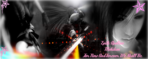
Originally Posted by koager
|
I say 2nd one also
for the first one I don't think sloppy is the word, maybe pixelated?
It's a thin font and also rotated thus the black stroke around the text became pixelated and doesn't look clean
but yes I think I like the placement of the 1st one like Loveless said and also on the 2nd one the names on top aren't parallel with the text on the bottom, its slanted downwards a little (heavy on the right), unless it's suppose to be like that
art school is too expensive for me T.T
|
o_O ty I hadnt noticed it was like maybe almost 8 am and I had'nt slept at all.
Ty guys for all the feedback ;D.


 .
.
 Linear Mode

