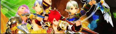
For one thing, the render/stock doesn't match or blend with the background at all. It could also contrast more. Nothing stands out much. Maybe you could fix the lighting and play with filters and blending. At its current state, it's bland.
Yar, the stock kind of looks a bit plain, and at first I thought it was Mr. T xD;;; I must be too tired tonight
__________________
"Stand up for what you believe is right, even if you're standing alone." Omies [5x Cleric] Fable [4x Archer] Omie [1x Mage] Wigglytuff [2x Fighter] Teva
Nakama //GrandPaprika // Symphony O-mie's Art Gallery || Sketch-Blog
The text could still use work, and the scanlines really take away from it. You would do much better with them. I still think you should do something to the stock/render, too.
Not to sound harsh, but I find this one a step down from the old one.
I think that the text takes away from it alot...smaller plainer texts achieve much effects. If it looks a bit plain to you throw a gradient on it or something. But thats jus my personal preference. with less text an - the scanlines it would be vellly nice.


 with less text an - the scanlines it would be vellly nice.
 Linear Mode

