|
 04-05-2009, 05:18 AM
|
#1
|
|
Imp
In-Game Name: S0uthp4w
Current Level: 6x OMFG finally a Warrior xD
Server: Epith
Posts: 20

|
Need help making sigs
Hai I'm new to making fiesta sigs (mostly because the sigs I'm used to making are a different kind than the different styles I see here).
My first piece of work is down below as my current signature.
It is just to get my foot into the door, so go as easy or as harsh as you wish. Trust me i can take any kind of criticism you have (both good and bad).
You can rate, comment, and hate, but I would MUCH appreciate any kind of help you have for me. xD
Thanks to all who have looked at and/or replied to!
Lates,
S0uthp4w
__________________
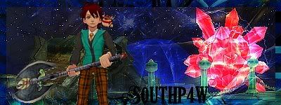
OMG its finally here >.> still fail at this tho xD
|

|
|
|
04-05-2009, 06:34 AM
|
#2
|
|
Digerati
In-Game Name: Ermengarde
Current Level: 82
Server: WE ARE TEVA !!
Posts: 434
|
lmao its not that hard to make them.
If you can send me a render then I can help you out
__________________

|
|
|
|
|
04-05-2009, 08:21 PM
|
#3
|
|
lk;sfdb
In-Game Name: Quit
Current Level: Quit
Server: Quit
Posts: 1,695
|
Hmmm.. I guess one thing to make sure you do when your making signatures is that you change up the quality of the pictures to make it fit together. Pop colors up, make it brighter, make it darker, etc.
Uh... hope that helped? XD
|
|
|
|
|
04-05-2009, 09:34 PM
|
#4
|
|
Imp
In-Game Name: S0uthp4w
Current Level: 6x OMFG finally a Warrior xD
Server: Epith
Posts: 20
|
Originally Posted by Kitager

|
lmao its not that hard to make them.
If you can send me a render then I can help you out
|
o.O O.o
Thanks for the offer, I appreciate it, but I would rather like to get better at doing this stuff soz i can make quality ones. xD
Thanks again!
__________________
OMG its finally here >.> still fail at this tho xD
|
|
|
|
|
04-05-2009, 09:34 PM
|
#5
|
|
Imp
In-Game Name: S0uthp4w
Current Level: 6x OMFG finally a Warrior xD
Server: Epith
Posts: 20
|
|
Originally Posted by Leesa
|
Hmmm.. I guess one thing to make sure you do when your making signatures is that you change up the quality of the pictures to make it fit together. Pop colors up, make it brighter, make it darker, etc.
Uh... hope that helped? XD
|
Contrasting colors....good idea. Guess i don't do much with them. Thanks, that really does help xD!
__________________
OMG its finally here >.> still fail at this tho xD
|
|
|
|
|
04-06-2009, 12:05 AM
|
#6
|
|
A to the R to the K
|
Just one thing for now - it's better to save your file as a .PNG, rather than .JPG. .JPG files usually loses some quality fromt he original.
|
|
|
|
|
04-06-2009, 12:25 AM
|
#7
|
|
Imp
In-Game Name: S0uthp4w
Current Level: 6x OMFG finally a Warrior xD
Server: Epith
Posts: 20
|
|
Originally Posted by a.L
|
|
Just one thing for now - it's better to save your file as a .PNG, rather than .JPG. .JPG files usually loses some quality fromt he original.
|
mmmmk thank you!
__________________
OMG its finally here >.> still fail at this tho xD
|
|
|
|
|
04-06-2009, 01:25 AM
|
#8
|
|
Super Moderator
In-Game Name: Espei
Posts: 8,305
|
Don't use too many fonts in one piece. Keep it down to 2 at most so it's not all over the place.
In terms of composition it's usually more... 'appealing' if you do not put the main image right smack in the middle like a bull's eye. But that's dependent on the image you use. Play around with scale as well. It's not always a bad thing to zoom in and crop out a piece.
|
|
|
|
|
04-06-2009, 10:07 PM
|
#9
|
|
Imp
In-Game Name: S0uthp4w
Current Level: 6x OMFG finally a Warrior xD
Server: Epith
Posts: 20
|
|
Originally Posted by Loveless
|
Don't use too many fonts in one piece. Keep it down to 2 at most so it's not all over the place.
In terms of composition it's usually more... 'appealing' if you do not put the main image right smack in the middle like a bull's eye. But that's dependent on the image you use. Play around with scale as well. It's not always a bad thing to zoom in and crop out a piece.
|
Text has ALWAYS been one of the toughest parts for me. So thanks for the input!
I usually, if not always, put the render in the center, so putting it somewhere else could help me get a better look...I have played around with scale but i usually don't crop the image, so that's another thing i can start to work with.
Thanks for the help!
__________________
OMG its finally here >.> still fail at this tho xD
|
|
|
|
|
04-06-2009, 11:46 PM
|
#10
|
|
AichtVeeGee4Life
|
Its been proven that the thing in the center of an image is less appealing to the eye, and that it is best to put most important elements 1/3 away from any edge of the frame.
Adding a color to act as a border always make the words stand out.
__________________
 ● If I kill you, that means I'll be the one closest to you when you're on your deathbed●
● If anyone else kills you, I'll kill that person●
Disclaimer:150% guy I prefer the siggys with the hot babes for my own visual gratification!"
TEVA: ||Zwivix (Lv.103)[Ranger]||Holy_VanGuards||♥Nilathiel♥
||iThePirate(Lv.66)[Warrior]||VanGuards
||GardenWeasel(Lv.50)[WizMage]||VanGuards
|
|
|
|
|
Currently Active Users Viewing This Thread: 1 (0 members and 1 guests)
|
|
|
 Posting Rules
|
You may not post new threads
You may not post replies
You may not post attachments
You may not edit your posts
HTML code is Off
|
|
|
All times are GMT. The time now is 08:20 PM.
Design by Vjacheslav Trushkin, color scheme by ColorizeIt!.
Powered by vBulletin® Version 3.8.6 Copyright ©2000 - 2024, Jelsoft Enterprises Ltd.
| |


 Linear Mode
