|
 08-04-2009, 03:17 PM
|
#1
|
|
Bad Kid

|
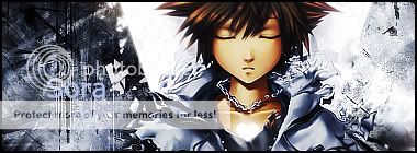
New Sig
I think this is my best siggie i made=]
Followed this tut
http://www.sigtutorials.com/tutorial...ic-grunge.html
------------------------------------------------------
Fixed it a lil

Last edited by Lirange; 08-04-2009 at 07:48 PM..
|

|
|
|
08-04-2009, 04:30 PM
|
#2
|
|
:w
|
Yup. Best one.
|
|
|
|
|
08-04-2009, 04:48 PM
|
#3
|
|
Super Moderator
In-Game Name: Espei
Posts: 8,305
|
Very nice.
Though I think you can do without the text or choose a different font. You can't see it and it doesn't quite go along with the work you've done behind it which is amazing.
|
|
|
|
|
08-04-2009, 05:26 PM
|
#4
|
|
O(≧∇≦)O ~♪
In-Game Name: yufu,Vangel
Current Level: 61, 26
Server: West
Posts: 1,814
|
*0000000* lirangeeeeeeee thats definately your best yet 8DDD
and maybe you could try lowering the opacity of the text or try changing the layer thingy xD
__________________

|
Quote:
|
96:What's 『マジか』?
97: >>96 are you serious?
98:Yes, I am.
99:that was an answer, not a question
|

Dragon Nest
IGN: leafie, Xiol
Class: Acrobat, Mystic
Guild: Duality
Server: Velskud (West)
|
|
|
|
|
08-04-2009, 05:35 PM
|
#5
|
|
Cave Archmage Book
|
I love it.
__________________
I am a proud member of G____G
|
|
|
|
|
08-04-2009, 05:47 PM
|
#6
|
|
Bad Kid
|
eh yea, I don't know how to make the text flow with the siggie, i'll see if i can remove it
|
|
|
|
|
08-04-2009, 05:47 PM
|
#7
|
|
Super Moderator
In-Game Name: Espei
Posts: 8,305
|
Black text, set it to Overlay, and slap on a discreet glow on the edges. Gives a nice effect.
Move it down and to the left by like 15-20 pixels too. If the above effect doesn't quite work out you can sample a lighter colour from the right with the eye dropper so that it matches the sig.
|
|
|
|
|
08-04-2009, 06:30 PM
|
#8
|
|
lk;sfdb
In-Game Name: Quit
Current Level: Quit
Server: Quit
Posts: 1,695
|
@_@ Like everyone said, its your best yet. I LOOVEEE ITTT *O*
|
|
|
|
|
08-04-2009, 07:49 PM
|
#9
|
|
Bad Kid
|
Originally Posted by Loveless

|
Black text, set it to Overlay, and slap on a discreet glow on the edges. Gives a nice effect.
Move it down and to the left by like 15-20 pixels too. If the above effect doesn't quite work out you can sample a lighter colour from the right with the eye dropper so that it matches the sig.
|
Thanks alot!
I like it better in overlay, but you couldn't see the r, so i put it in dissolve. Still looks good.
Eh, did i move the text to much? |
|
|
|
|
08-04-2009, 09:09 PM
|
#10
|
|
Phinofly
In-Game Name: Healing_Touch, B.B. Hood
Current Level: Paladin 7x, Hawkarcher 5x
Server: Epith
Posts: 103
|
what program did you use to make that?
__________________

The things that cannot be cut by my Roukanken, forged by youkai, are close to none! -Youmu Konpaku
|
|
|
|
|
Currently Active Users Viewing This Thread: 1 (0 members and 1 guests)
|
|
|
| Thread Tools |
Search this Thread |
|
|
|
| Display Modes |
 Linear Mode Linear Mode
|
 Posting Rules
|
You may not post new threads
You may not post replies
You may not post attachments
You may not edit your posts
HTML code is Off
|
|
|
All times are GMT. The time now is 09:52 AM.
Design by Vjacheslav Trushkin, color scheme by ColorizeIt!.
Powered by vBulletin® Version 3.8.6 Copyright ©2000 - 2025, Jelsoft Enterprises Ltd.
| |